A couple of weeks ago there was a significant fracas over Daniel MacArthur‘s tweeting from a Cold Spring Harbour Laboratory meeting. This was followed in pretty quick succession by an article in Nature discussing the problems that could be caused when the details of presentations no longer stop at the walls of the conference room and all of these led to a discussion (see also friendfeed discussions) about how to make it clear whether you are happy or not with your presentation being photographed, videoed, or live blogged. A couple of suggestions were made for logos or icons that might be used.
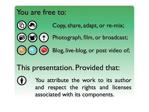
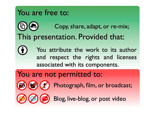
I thought it might be helpful rather than a single logo to have a panel that allows the presenter to permit some activities but not others and put together a couple of mockups.


I’ve also uploaded a PowerPoint file with the two of these as slides to Slideshare which should enable you to download, modify, and extract the images as you wish. In both cases they are listed as having CC-BY licences but feel free to use them without any attribution to me.
In some of the Friendfeed conversations there are some good comments about how best to represent and suggestions on possible improvements. In particular Anders Norgaard suggests a slightly more friendly “please don’t” rather than my “do not”. Entirely up to you, but I just wanted to get these out. At the moment these are really just to prompt discussion but if you find them useful then please re-post modified versions for others to use.
[Ed. The social media icons are from Chris Ross and are by default under a GPL license. I have a request in to make them available to the Public Domain or as CC-BY at least for re-use. And yes I should have picked this up before.]
